
Braniff Airways
I designed a responsive website and a branding revamp of an iconic airline brand

Overview
ROLE & DURATION
UX / UI designer
2weeks
Braniff Airways, Inc., operating as Braniff International Airways, from 1948 until 1965, and then Braniff International from 1965 until closure, was an American airline that flew air carrier operations from 1928 until 1982 and continues today as a retail, branding and licensing company, administering the former airline's employee pass program and other administrative duties.
GOAL
SOLUTION
Create a responsive website focused on allowing the customers to book, search and make online check-ins while retaining the Braniff Airways iconic brand.
The goal of this project is to re-brand and bring Braniff Airways back to the modern airline industry with a new and improved website focused on the customers’ needs.

Research
RESEARCH COMPONENTS
Competitive analysis
User interviews
RESEARCH GOALS
I started this research by looking at the airline industry, the competition, and started to formulate questions around users experience on booking airline tickets. The research goals I set for this project were:
To compile reports of how competitors offering of travel booking/reservations
To find out what problems users encounter when booking flights
To find out the preferred device used to check in to their flights.
To understand the ‘Braniff Airways’ responsive website I would be developing I studied:
Both direct and indirect competition
Compare and contrast what competitors are doing.
The essential features to incorporate
The features that would be nice to have would make Braniff Airways distinctively different.

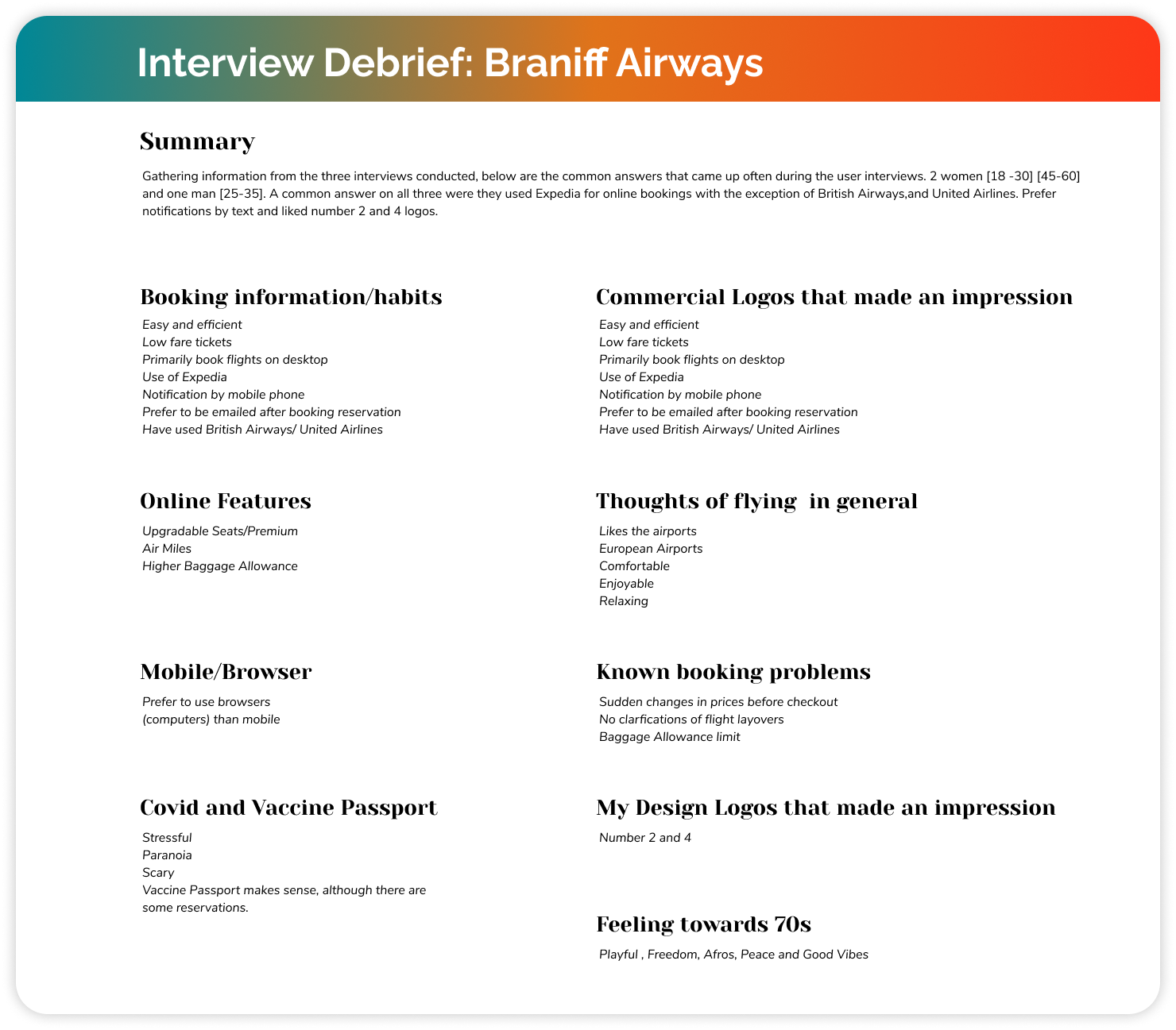
The user interviews were very insightful for producing the responsive Braniff Airways website. Results suggest that users primarily search for low-fare tickets, use a website that is easy and efficient, and prefer to use a website browser as their preferred device choice. Qualitative research interviews revealed that users generally liked flying, airports were the main attraction to flying and users found the recent pandemic stressful and scary to their flight experience. For design purposes, it was also vital to know their impression of the 70s, users found the 70s to be a playful and peaceful time, with overall good vibes.
After organizing the research, I created this persona that was distilled from the pool of information and shaped by the most notable divisions between temperament: social investment, online habits, and inclination to logic or emotion.

One of the questions that were asked during the user interview was to pick the logo based on their first impressions of the logos and what stood out to them. Research participants heavily preferred Logo 2 and Logo 4. Users felt that these logos related more to the 70’s era with their round edges and friendly look. This served as an important step when going into the design phase of this project as it was incorporated into the UI design.

Define
User Flow
To understand the user flow of online flight booking reservations, I went on several airline booking websites to go through the process of booking a ticket and making a reservation.
There were several instances that I wanted to answer through this core flow :
User ability able to book a flight
User ability to view flight prices by class.
User ability to choose their flight seats.
Sketches of Homepage and Flights results page.
For my initial sketches, it was important to lay down what the visual hierarchy and structure of the wireframes would be. I created lo-fi wireframes on selected pages to gradually see how all the elements could be presented. This served as the foundation for the UI designs that would be coming later.


Provisional lo-fi wireframes of desktop and mobile pages.


Design
After completing the define phase, I set about building the UI and wireframes of the web and mobile sites to Braniff Airways. Virgin Atlantic and British Airways were inspirations to building this website as they were modern and simple while I added a 70s touch with colors and abstract shapes.


Braniff Airways popular in the 70s, it was important to visually capture that feel and experience of that time but also reflect the modern age in which it is coming into. I selected these images are a source of inspiration when developing the logo of the brand. Colors and font choices were really important to bring back the vibrancy of the Braniff Airways brand.

Creating the logo itself was a fun experience as it brought out my illustrative skills and artistic vision I have for ‘Braniff Airways’. I produced three variants of what i visualized what the ‘Braniff Airways’ brand would be.


Braniff Airways Flow (Pre-test)
Referring back to my research, it was vital that the ‘Braniff Airways’ website was clean and easy to use, as user’s frustration pointed out that it wasn’t pleasant to their experience with information was cluttered to not legible to read.

Testing
Test
Task Error-free rate
80%
I created a high-fidelity prototype of the desktop site. This was created using Figma and the usability test was conducted remotely. It was really insightful as their feedback pointed out that:
Users wanted to check their baggage allowance way earlier before the review and pay page.
Users wanted better visual distinctions between flight classes
Users weren’t likely to subscribe to the Premium, so an alternative solution needed to be made
Users wanted more match information on the Highlight screens.
TASKS
Task completion rate
100%
• Gauge how long it takes a user to book a flight from start to finish
• To be able to click on the desired destination and book a flight.
• Gauge user’s initial response when visiting the website.
• Observe what issues or problems the user may face while browsing through the site

Afterthoughts
Looking through the usability test result, a high priority amongst the users was to have a better visual hierarchy on the departing flights page. This included being able to differentiate between the flights classes, showing baggage allowances and in-flight features on the departing flights. Below is a before and after of the changes that were made for the departing flights page
Before

After


Braniff Airways Prototype